
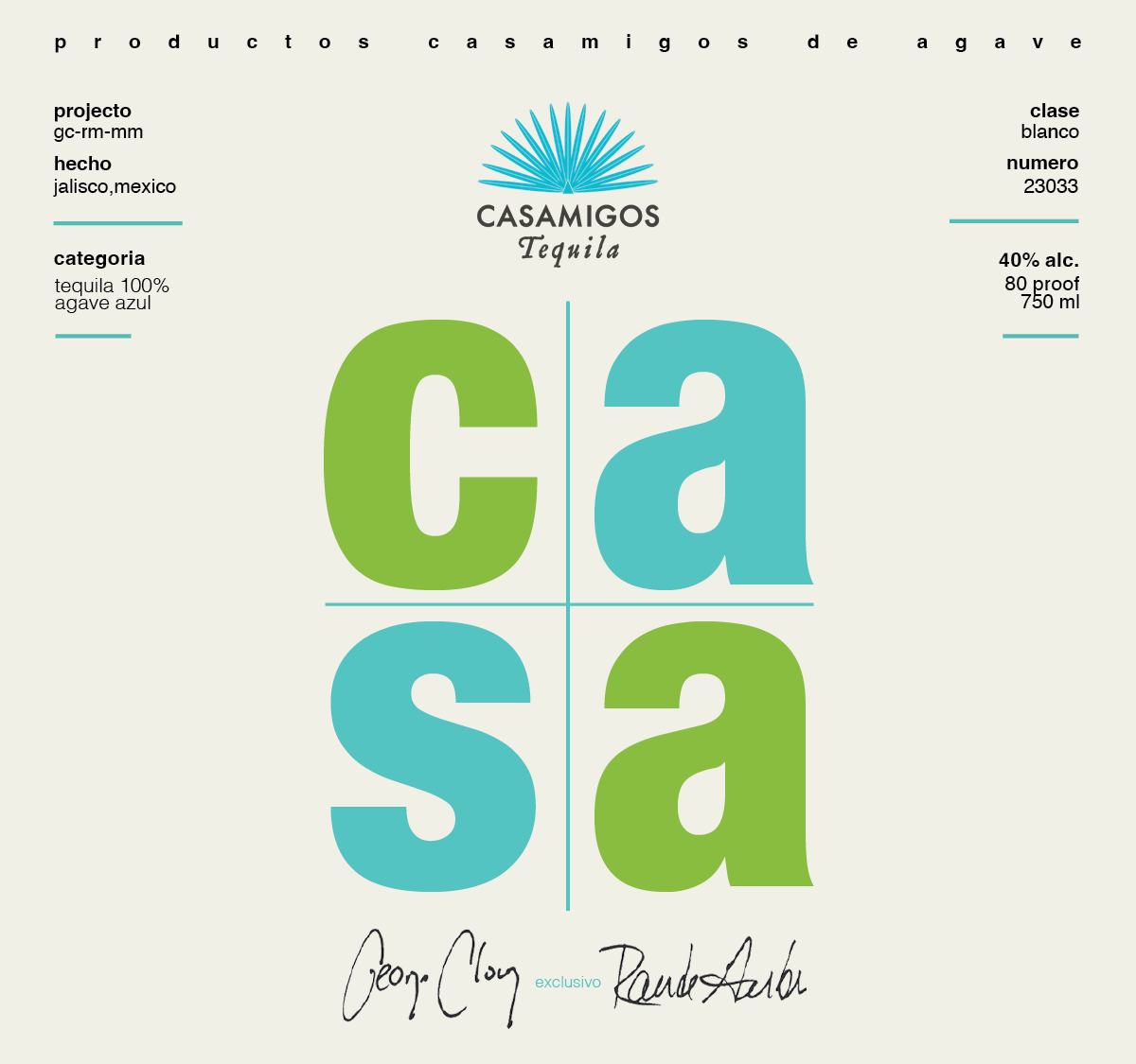
A school project: By leveraging the principles of Swiss design and drawing inspiration from the brand’s existing colour palette, the result is a crafted label that seamlessly merges vintage aesthetics with contemporary sophistication.
Casamigos Rebrand

Marketing: Coasters

Advertising: Billboard
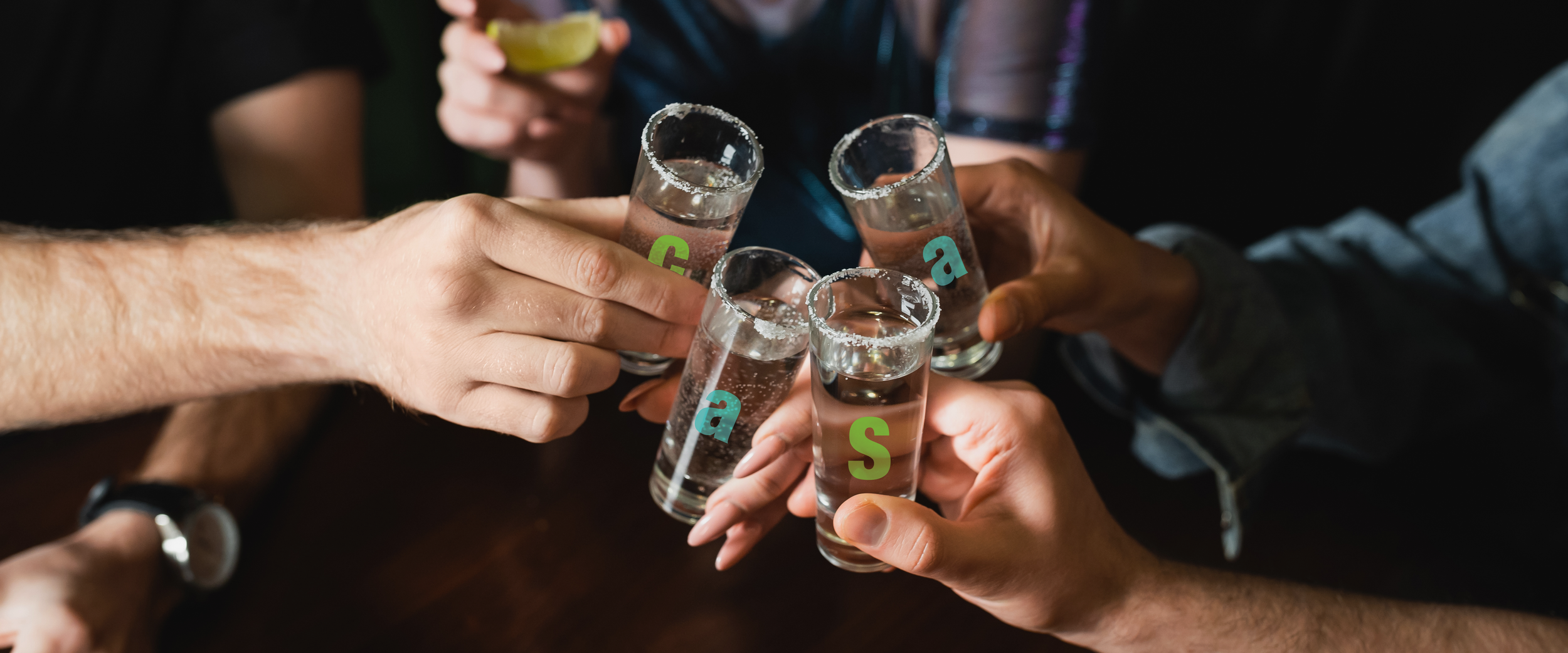
Merchandise: Shot Glasses

Marketing: Bar Poster

Typography: Helvetica Neue
& Minoria
Helvetica Neue is a clean, neutral, and versatile typeface, perfectly aligning with the Swiss design style, which emphasizes clarity, readability, and simplicity. This choice modernizes Casamigos, projecting sophistication and balance in a minimalist layout, much like the new bottle design that is sleek and unembellished.
Minoria (used for the headlines in the marketing materials) carries a modern, rustic elegance with its bold yet slightly textured appearance, reflecting the handcrafted, welcoming feel associated with tequila. It evokes authenticity and warmth, making it suitable for a brand like Casamigos, which prides itself on being approachable and premium.
Process Work
It all begins with an idea and many, many revisions. Here are some of the labels that didn’t make the final cut.

Digital Drafts
Casamigos Rebrand
Date
10/16/2023


