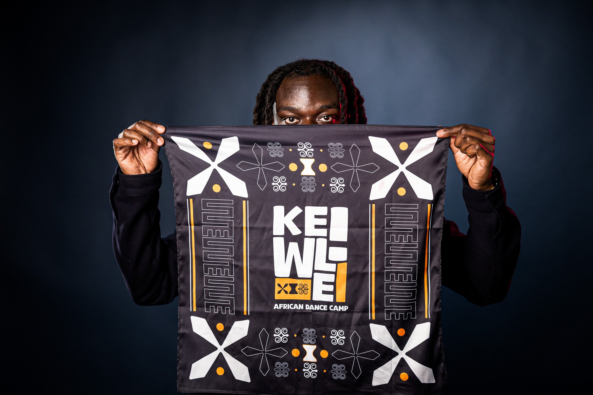

Established in 2019, Kelewele African Dance Camp is dedicated to pushing culture and community through dance, led by Toronto-based choreographer Kwasi Obeng. He entrusted me with rebranding the camp, designing a bold new logo and a custom bandana that authentically reflects his energy and vision. Through close collaboration, thorough research, and the inclusion of Adinkra symbols, I created a design that captures the rhythm, movement, and cultural essence of his brand.
Kelewele African Dance Camp
-
![]()
Full Colour
-
![]()
Black on White
-
![]()
White on Black


Adinkra Symbols
Adinkra symbols are a rich visual language from the Akan people of Ghana, carrying deep meanings rooted in wisdom, strength, and community. Traditionally used in textiles, pottery, and storytelling, these symbols represent core values that shape West African culture.
For Kelewele, they serve as a bridge between movement and meaning. By integrating these symbols into the brand, the design captures the rhythm of movement while honouring the cultural essence of African dance and its role in fostering community and identity.
-
![]()
Boafo Ye Na
Willing Helper. This represents support, teamwork, and cooperation, which are fundamental to dance and community building.
-
![]()
Dono
Talking Drum. Symbolizing rhythm and praise, this is a direct connection to the heartbeat of dance and music.
-
![]()
Dwennimmen
Ram’s Horns. This represents strength, humility, and wisdom, embodying the resilience and discipline needed in dance.
-
![]()
Nkyinkyim
Twisting. A powerful symbol of movement, adaptability, and dedication, mirroring the fluidity of dance.
-
![]()
Circle
A universal representation of unity, energy, and the cycle of life, deeply rooted in West African dance traditions.


Merchandise: Bandana

Merchandise: T-Shirt

The logo before and after rebranding.
Typography: Brown
Beige Custom
The choice of Brown Beige for the brand name creates a bold and rhythmic foundation that reflects the energy of African dance. Its blocky yet expressive letterforms provide a strong visual presence, embodying movement and cultural vibrancy. To further enhance this sense of motion, the type was customized with organic distortions and hand-drawn imperfections, making the lettering feel more fluid and dynamic.
The integration of Adinkra symbols within the design reinforces the brand’s deep connection to African heritage, visually bridging tradition and contemporary expression while celebrating dance as both a cultural and communal experience.